The blue colours represent temperatures cooler than average, while hues of orange signify temperatures warmer than average.
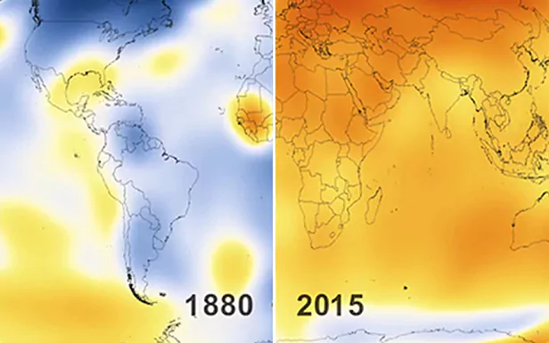
It is taken from the 1951-80 baseline average.
While the Earth appears predominantly blue in tone around the turn of the 20th century, there are noticable patches of orange that begin to appear from the mid-1930's.
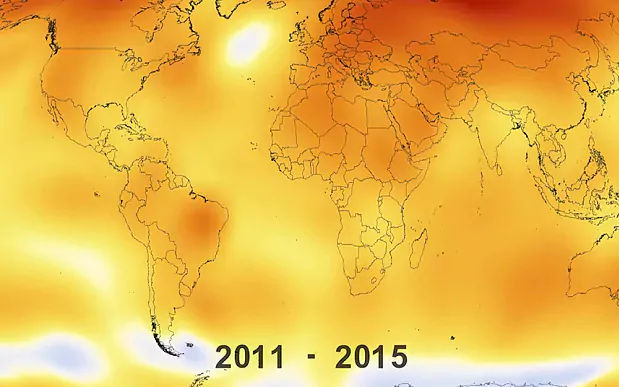
These gradually become more widespread, showing the long-term warming trend in action.
Source: The Telegraph | 2 June 2017